Technology and Education is Virtual Classroom
Virtual Classrooms are fast becoming an essential tool in delivering quality education effectively in off-campus environments for participants of regional and remote areas of the world. In a virtual classroom scenario, participants learn at their own pace. Settings can be either supervised or unsupervised with the instructor monitoring progress via evaluation. Although one of the only disadvantages is the technology at the hands of the recipient (poor internet or slow hardware) it means students can learn more rapidly than in a traditional classroom environment because they can learn at their own pace. With the growth and positivity of virtual classroom statistics booming (training takes 40-60% less time to complete than traditional classroom training, and eLearning produces an 18% increase in the workplace) it is little wonder that many corporations want to invest in the future growth of their companies.

Design a logo and brand strategy for an online learning campus
- Client
- Virtual Classroom
- Industry
- Online Education, Community
- Services
- Branding + Design
- About Project
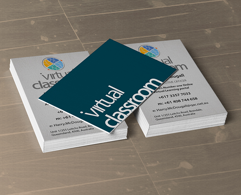
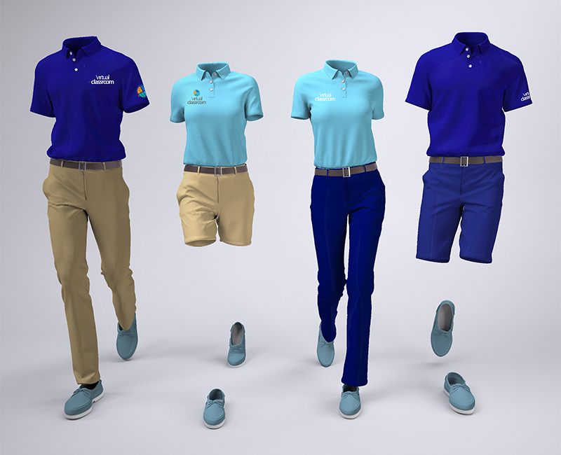
- Our approach to creating a striking and professional logo which would carry weight across all sectors was based upon simplicity. For this reason we used a simple combination logo. We were mindful of the progression of this brand and the how overall design had to properly represent the future use of this logo.
We felt that to portray positive growth and creativity adequately we needed to include colour and movement in the project.
- Project Brief
- Our brief was to create a dominant and modern logo identity for an emerging company engaged in delivering training in an online virtual classroom for a range of disciplines and customers in remote locations globally.
It was preferred that lower-case letters be used in the design, but not necessary.

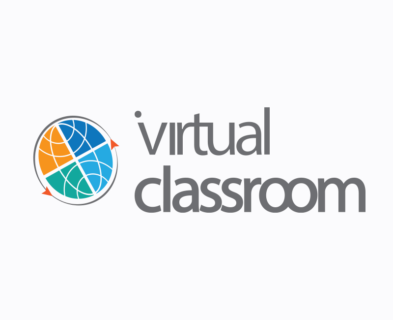
Working with a humanist font because of its friendly nature and friendly feel, we felt that Myriad Pro with its round tittle and angled ascender was the perfect choice. Tight kerning on several letters create a ligature effect. We used a variation in weights in the text headline to create diversity and emphasise strength in the typography where it was required. Deliberately, we moved the tittle on the i across to align with the ‘v’ in virtual; which subjectively suggests the human form.
The four colours were chosen to characterise loyalty and trust (blues). Two shades of this colour were chosen to compliment each other and represents calmness and responsibility; authority and knowledge. The blue-green or teal colour was selected to promote concentration. It also helps to provide balance with the selected colours in the design. To promote the creative aspects of virtual classroom, a muted Orange was taken.
So that movement could be established and incorporated into the design, the globe was placed on a 30 degree angle. An ellipse with arrows surrounding the globe portray direction and clearly identify the inclusive reach virtual classroom has.