See how this rebrand gets the nod in the corporate sector
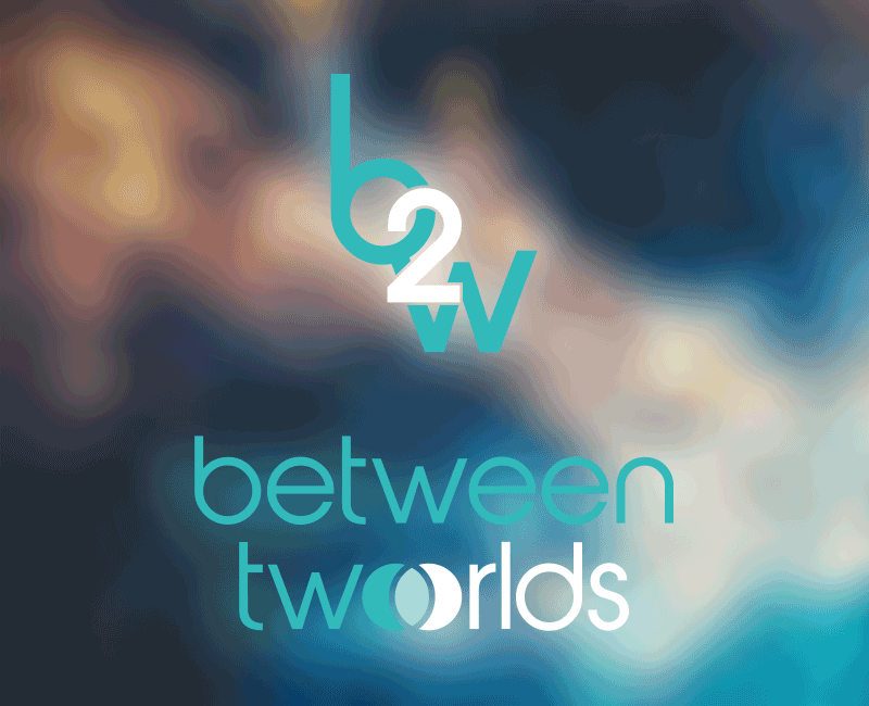
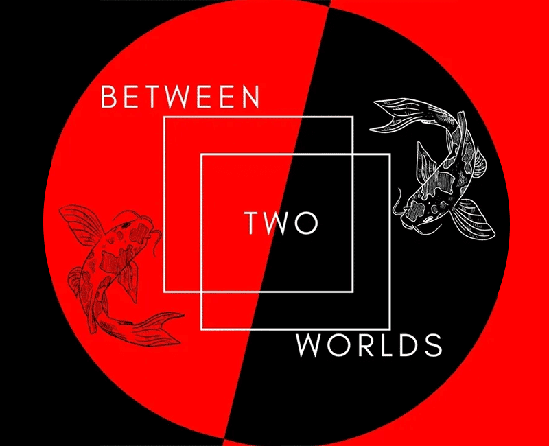
Between Two Worlds is a creative film production agency in Anandale, Sydney, offering marketing solutions, including the creative direction in advertising, promotions and events and the music and fashion industry. With such an expressive and prolific background, suggesting a correlation between the imaginative and the physical ‘creative world’ was essential. Hence, the intersecting circles in the wordmark symbolically represent the worlds of science, imagination and creation—a trinity of variants which become one. Out-of-the-box artistry is part of this company’s vision, and it was crucial to try to capture the essence and style of this business.
Logo redesign which has a modern minimal feel
- Client
- Between Two Worlds
- Industry
- Videography, Marketing
- Services
- Logo Rebrand
- About Project
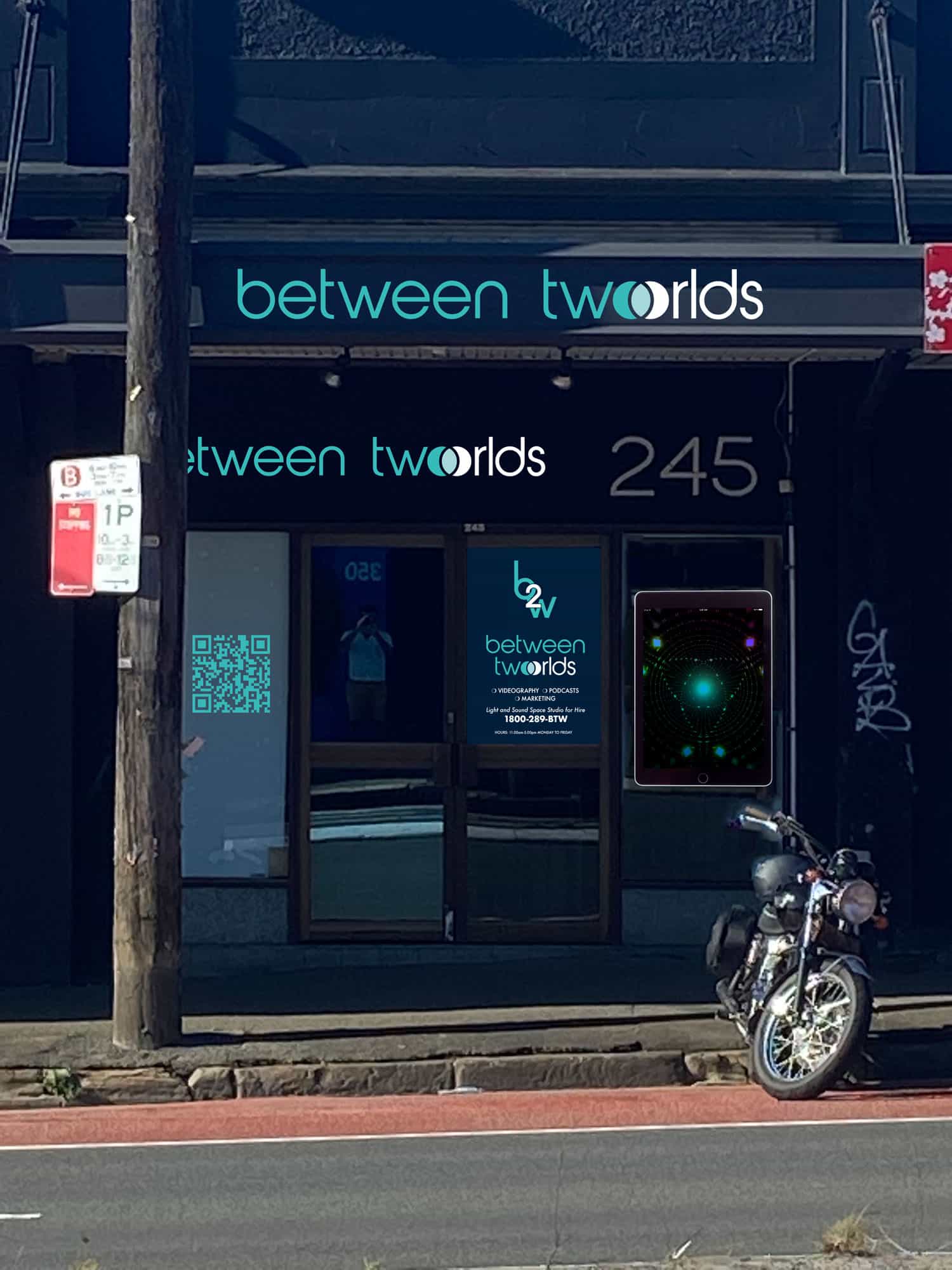
- To compete with a saturated market of videography in Sydney, we needed to simplify and modernise Between Two Worlds brand while retaining the connection between the innovative and artistic aspects of Beau Magloire's craft.
- Project Brief
- Southern Cross Graphics was retained to refresh and rebrand a logo design that would reposition Between Two Worlds to gain more attention while driving sales in a competitive advertising market. While maintaining a unique feel, it was hoped that the rebrand should be able to stand beside its competition and project an air of professionalism and corporate identity.
This rebrand ticked so many boxes with endless possibilities because of the subject matter. Staying true to self without flamboyance and theatrics in the brand required discipline.
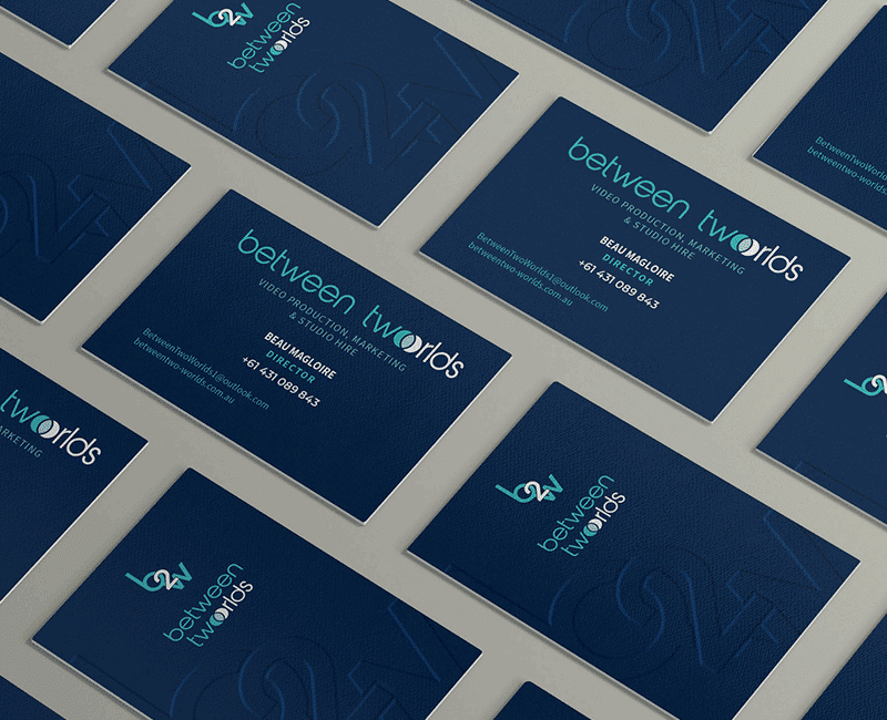
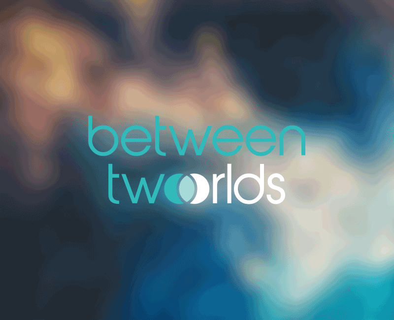
To emphasise the requirement’s corporate aspects, a beautiful sans serif font, “abeatbyKai” was chosen. Its lovely rounded form provides a humanist feel to the brand and follows a clean minimal style. Lowercase letters preserve their casual appearance. The more oversized monogram of the joined letters in Between Worlds creates a striking contrast in colour and form because of the stark white and the numerical letter form 2 to represent to.
This rebrand ticked so many boxes with endless possibilities because of the subject matter. Staying true to self without flamboyance and theatrics in the brand required discipline.
To emphasise the requirement’s corporate aspects, a beautiful sans serif font, “abeatbyKai” was chosen. Its lovely rounded form provides a humanist feel to the brand and follows a clean minimal style. Lowercase letters preserve their casual appearance. The more oversized monogram of the joined letters in Between Worlds creates a striking contrast in colour and form because of the stark white and the numerical letter form 2 to represent to.