Gentle, healing Bowen therapy
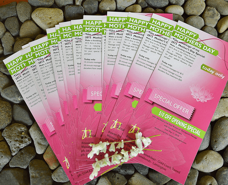
Toni Nicol therapies offer safe, gentle, effective Bowen therapy treatments in a relaxing environment. Toni’s background in health and wellness are far-reaching and has been a practising bodywork provider for a number of years. With the establishment of Toni Nicol therapies, treatment plans targeting pain relief either in clinic or mobile were added to the long list of services afforded by Toni Nicol therapies.

Design a logo suitable for massage therapist
- Client
- Toni Nicol therapies
- Industry
- Health and Wellness, Massage Therapy
- Services
- Logo & Identity | Design
- Project Brief
- Toni required a logo that would suit her growing business as a massage therapist. Although the logo needed to look professional, it was hoped that it would not take on a corporate feel.
- About Project
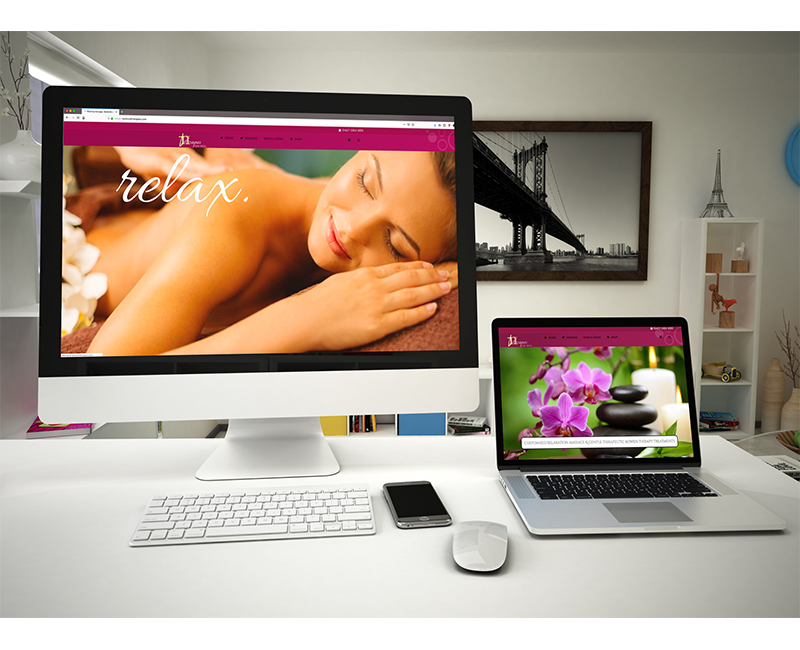
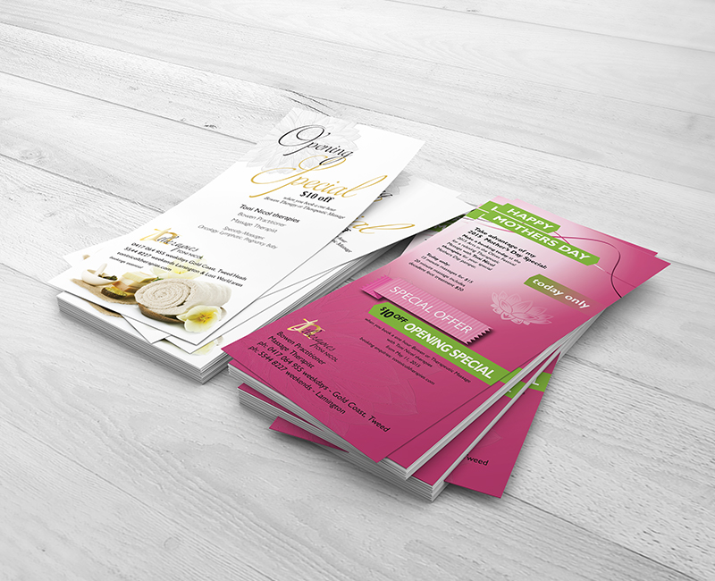
- Toni needed a website that would attract customers to her new business at Coolangatta and in the catchment area surrounding Christmas Creek. Incorporated into the web-build was the design of a logo to suit her new practise and web-graphics for the website. Copywriting and some SEO were used to help build a web-presence for Toni Nicol therapies.
This logo was designed to deliberately flaunt all the rules. Toni did not want a logo that shouted ‘look at me’. The project brief demanded a personal logo without a cookie-cutter presence, a logo that looked professional yet afforded a sense of privacy without being understated. A modest design that was simple in style offered elegance with not one, but three fonts. We overcame this through repetition of the script font and incorporated the same font into the headline ‘therapies’ in a crisp black colour. This then became the main focus and quickly announced to the audience that it is a health and wellness business.
The alternative text TONI NICOL in an open sans serif font which we capitalised further adds to the sophistication.
We chose to create a simplistic logo that depicted a contemporary style while maintaining a link to traditional elements.
Teamed with a crisp sans serif font ‘Lato’ and non-traditional typography favouring a lower-case expression in this instance, implies youth and distinction. Variations of black in the typography helped to preserve a familial and uniform appearance.